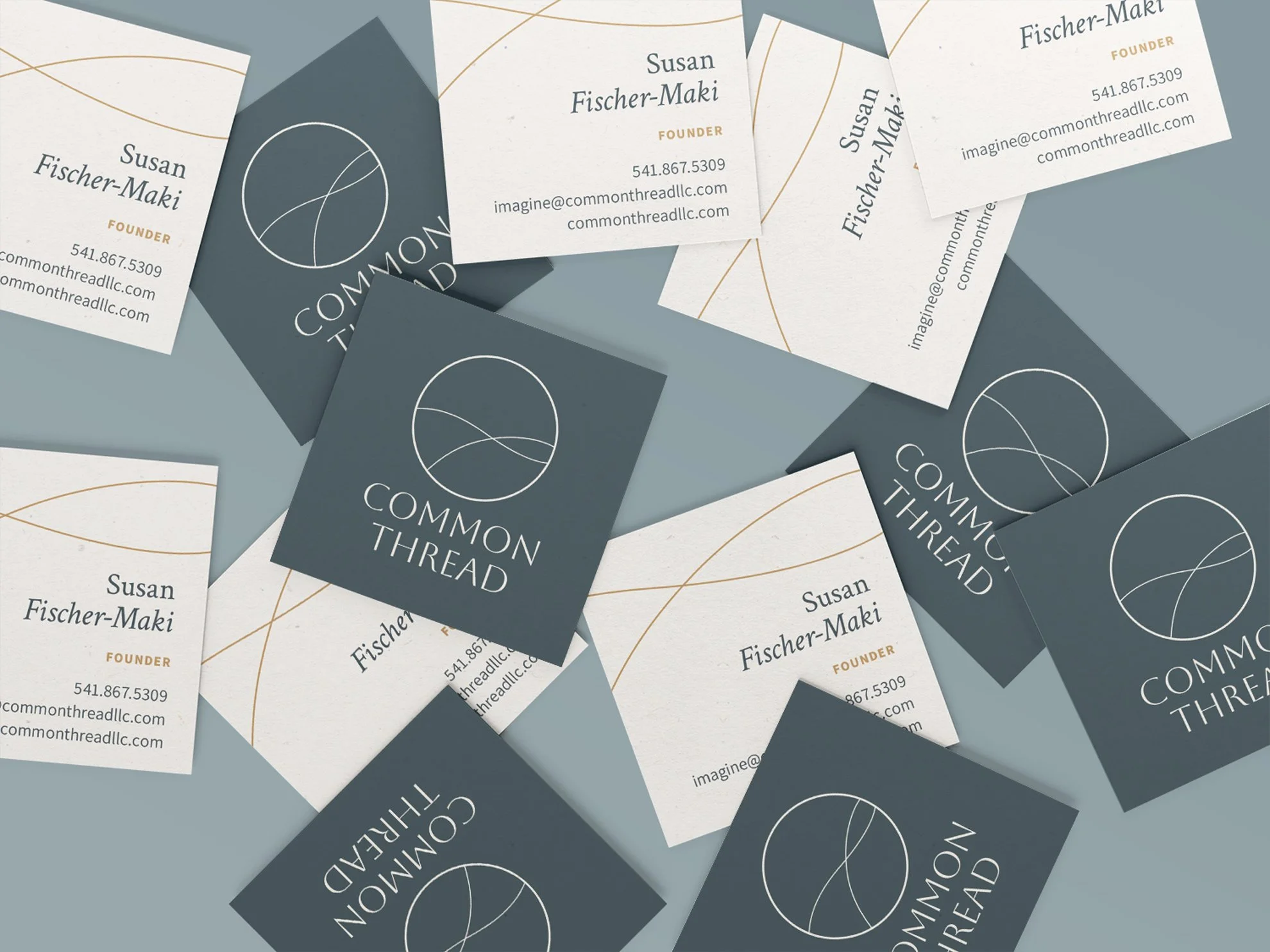
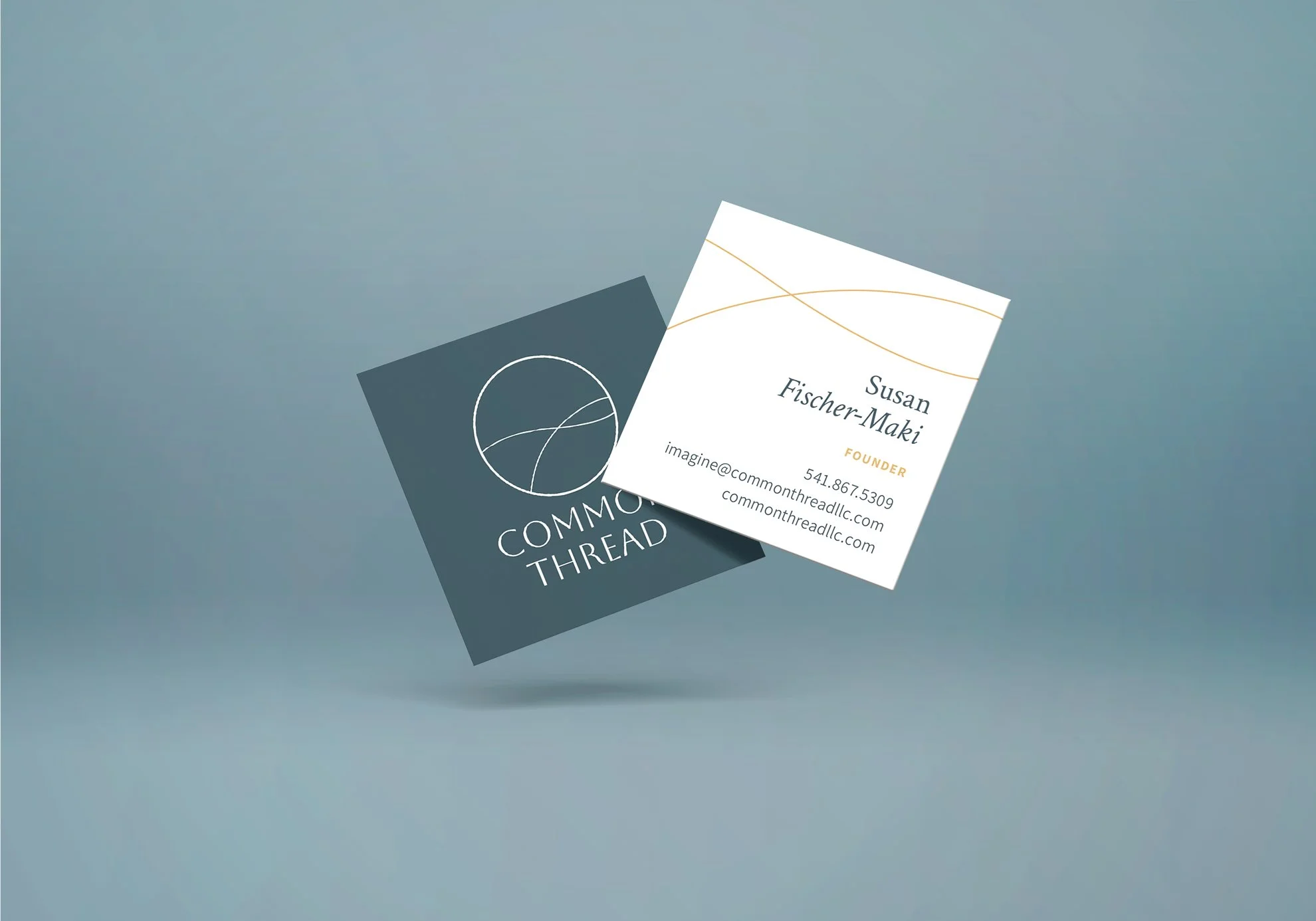
Bringing a consultancy's ethos to life through branding requires strategic design. For Common Thread Consulting, the new visual system captures their essence as an approachable, evolving partner.
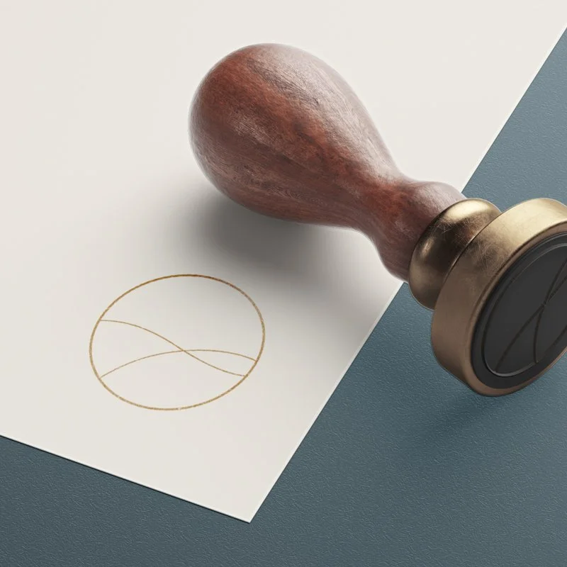
The logo's thread-like lines represent converging perspectives, reflecting their mission to unite communities. Cropped from a cursive 'T', it focuses on interconnectedness and evolving shared understanding.
The soothing blue and tan palette reflects values of belonging, transparency and innovation. Blue signifies fluid thinking while earthy taupes ground the palette, embodying Common Thread’s dynamic blending of ideas.
Intentional typography choices complement the friendly consultancy feel. Crimson text adds relaxed professionalism. Source Sans offers legibility, creating thoughtful hierarchy.
This cohesive brand foundation authentically promotes Common Thread’s mission of building connections for positive impact. Strategic elements provide a memorable, flexible system.