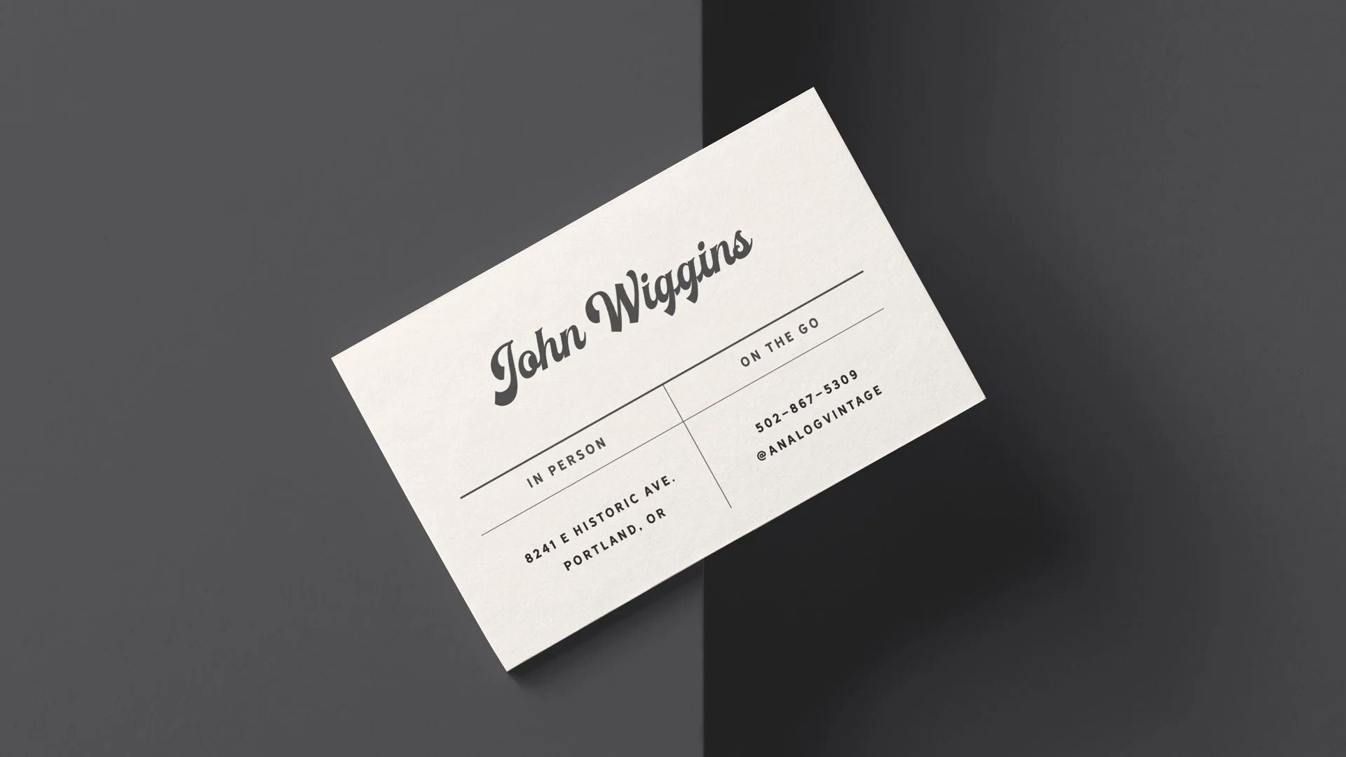
For years, owner John Wiggins ran a highly-rated reselling business that lacked a cohesive brand. To build customer loyalty and recognition, we devised a no-nonsense name that clearly described his niche market.
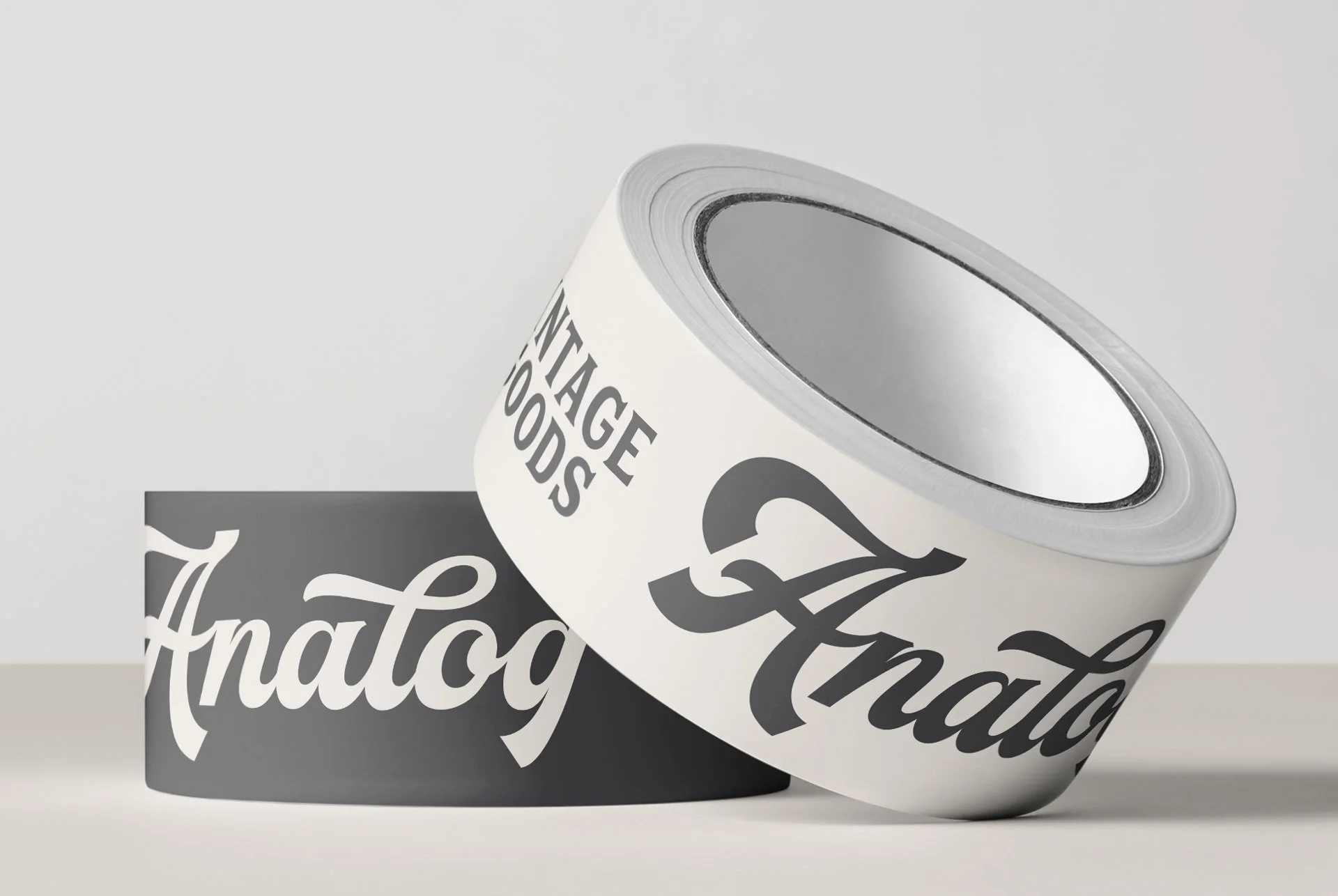
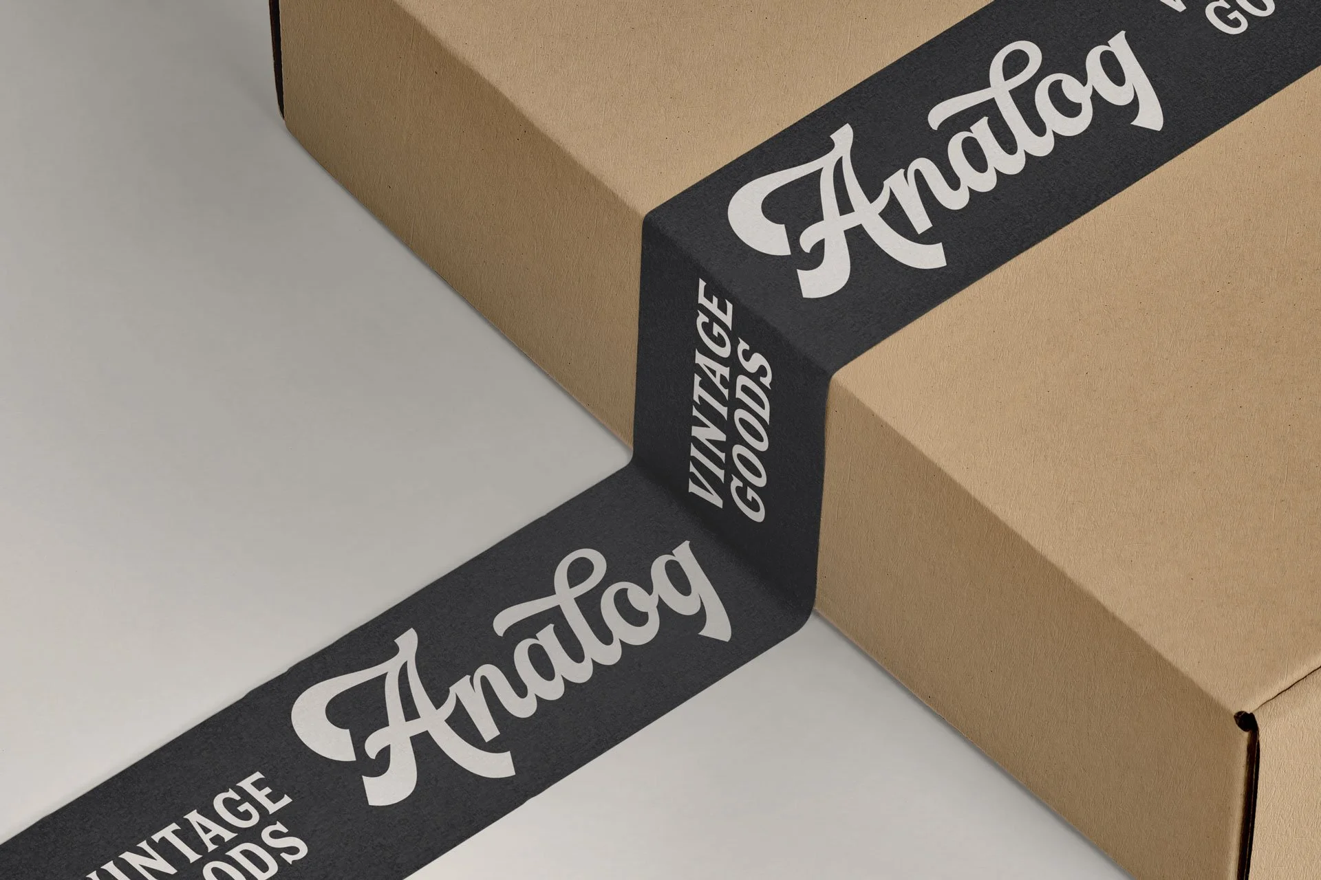
The logotype uses thick, sweeping letterforms like you might see on a hand-painted sign from a bygone storefront. The simple faded black and off-white color palette subtly imply an aged or antique effect.
We then identified how customers interact with Analog and created branded materials for each engagement.
Analog continues to build loyal customers who return for the customer service, attention to detail, and unique vintage goods.