U.S. Family Advocacy Program
Logo design, visual identity, brand collateral

-
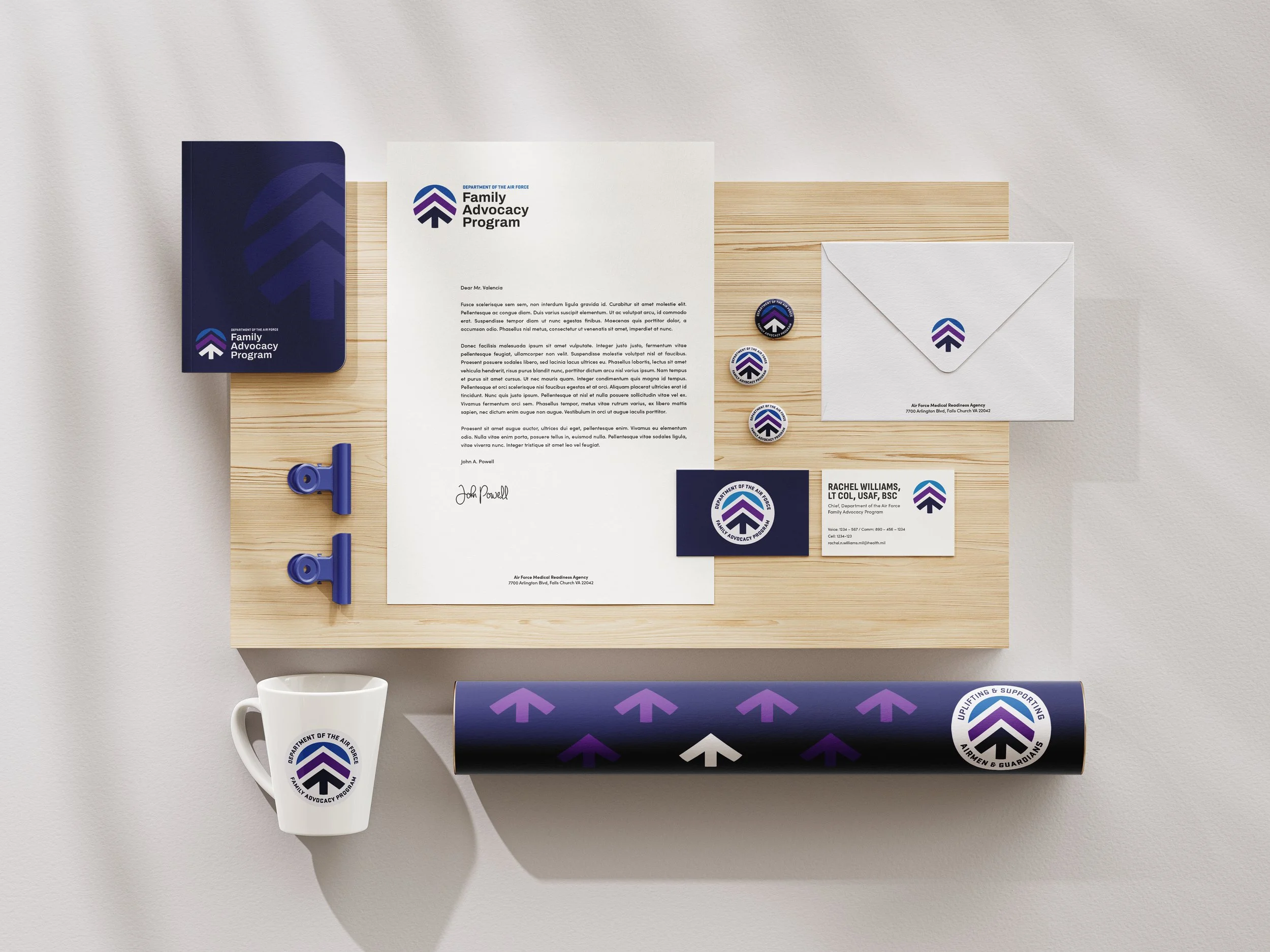
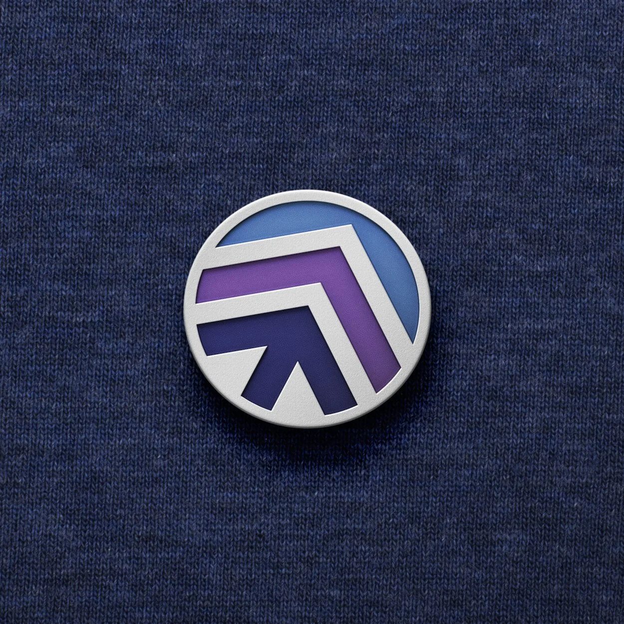
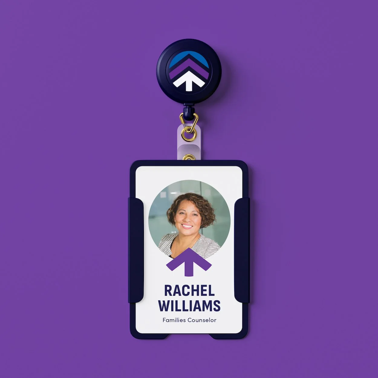
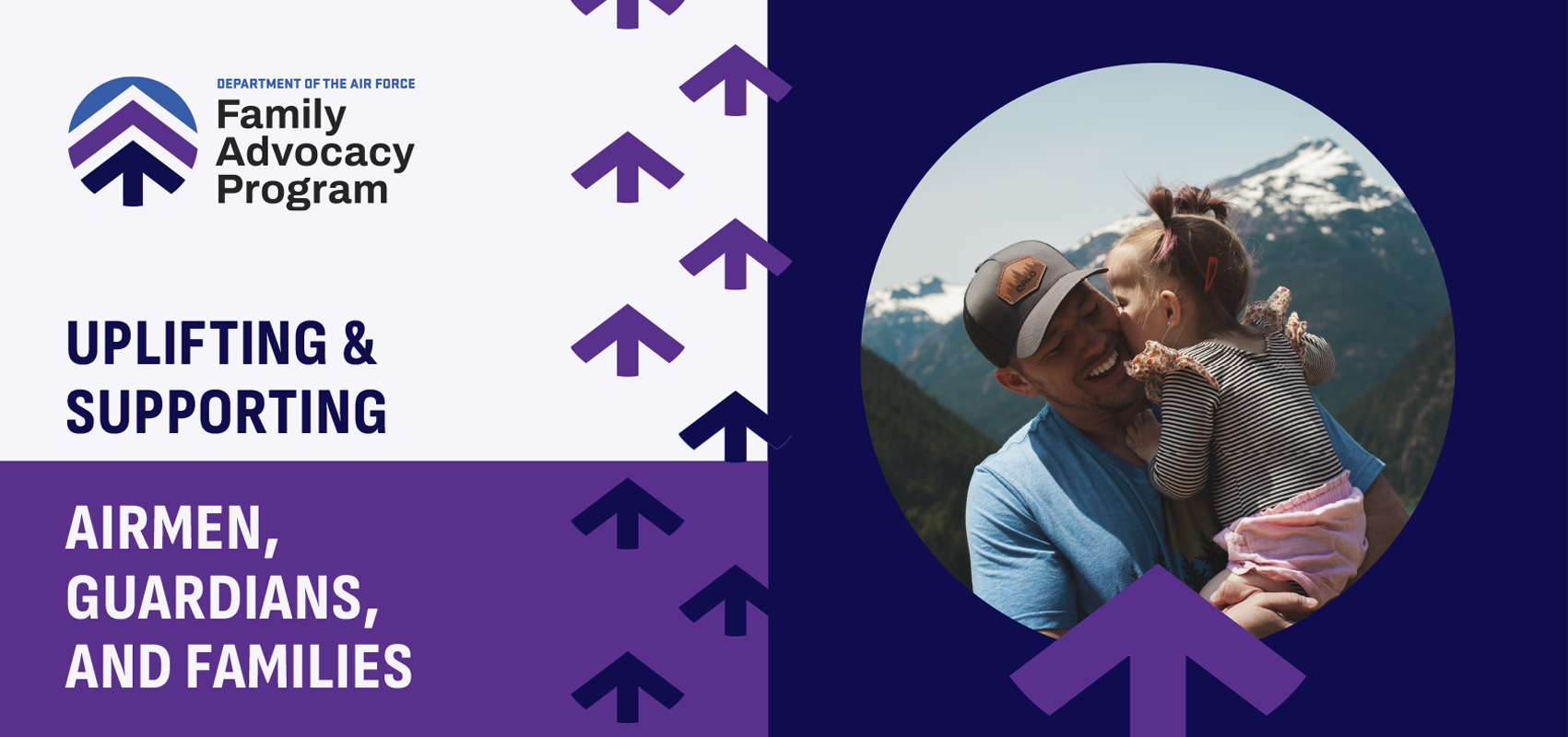
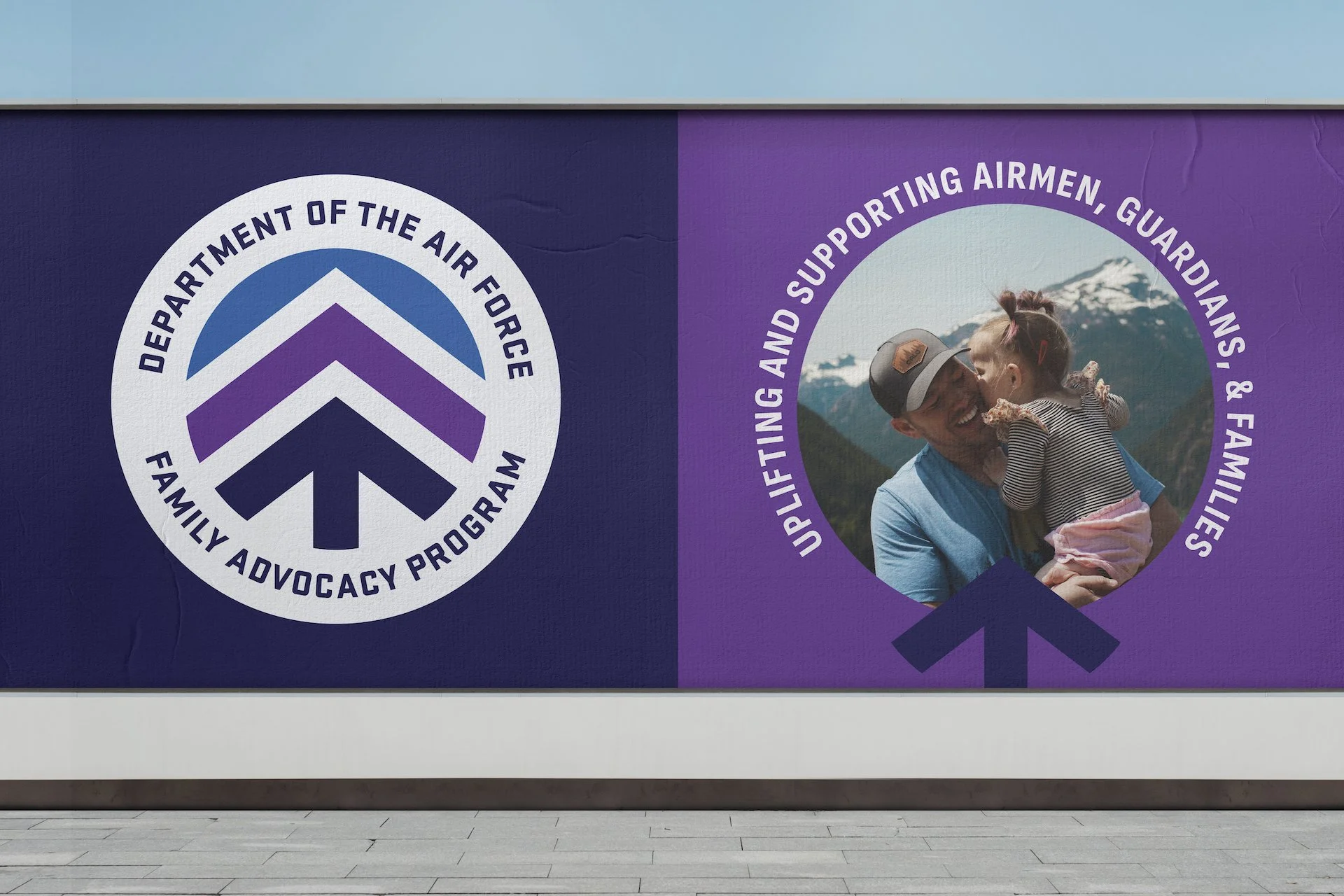
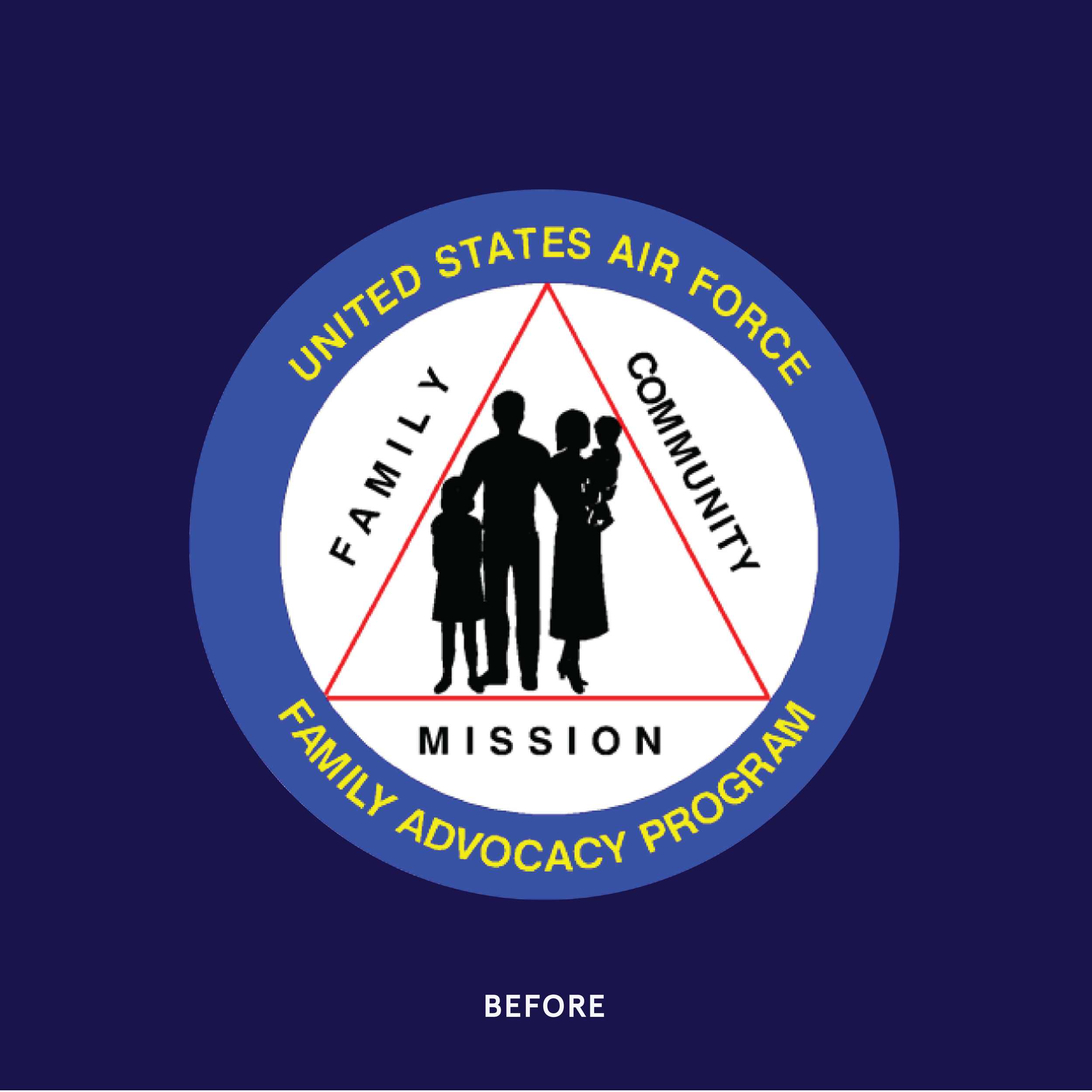
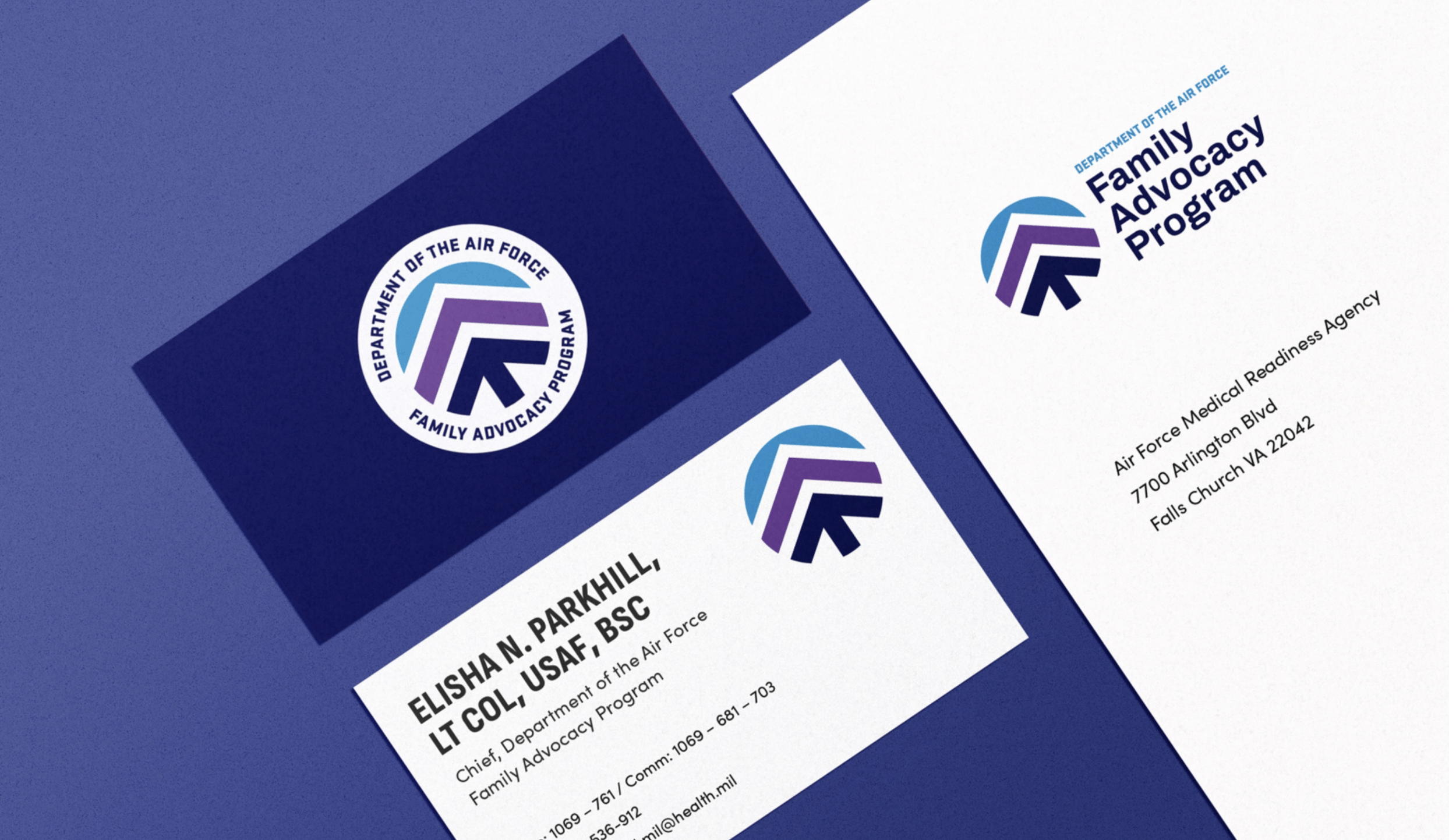
Kat led the rebranding effort for the USAF Family Advocacy Program, transforming its dated image into an inclusive and hopeful visual identity. She guided the creation of 'the Oak' emblem, symbolizing strength and growth, which resonated with both service providers and recipients. This strategic redesign aligned the program with USAF and Space Force brands, enhancing its credibility and inspiring continued community support.
Work completed at Fathom Creative. The project team included:
Kat Scott – Creative Direction, Bethany Whitlock – Art Direction/Design, Heather Gregg – Project Management