The Milton at Twinbrook Quarter
Logo design, visual identity, brand collateral


-
In the heart of Rockville, Maryland, The Milton at Twinbrook Quarter emerges as a beacon of elegance and modern luxury. Named for the developer's grandfather, this premier living experience blends Art Deco sophistication with contemporary comfort. BF Saul faced the challenge of creating a fresh identity for their new luxury apartment complex, drawing inspiration from the rich tapestry of Art Deco design.
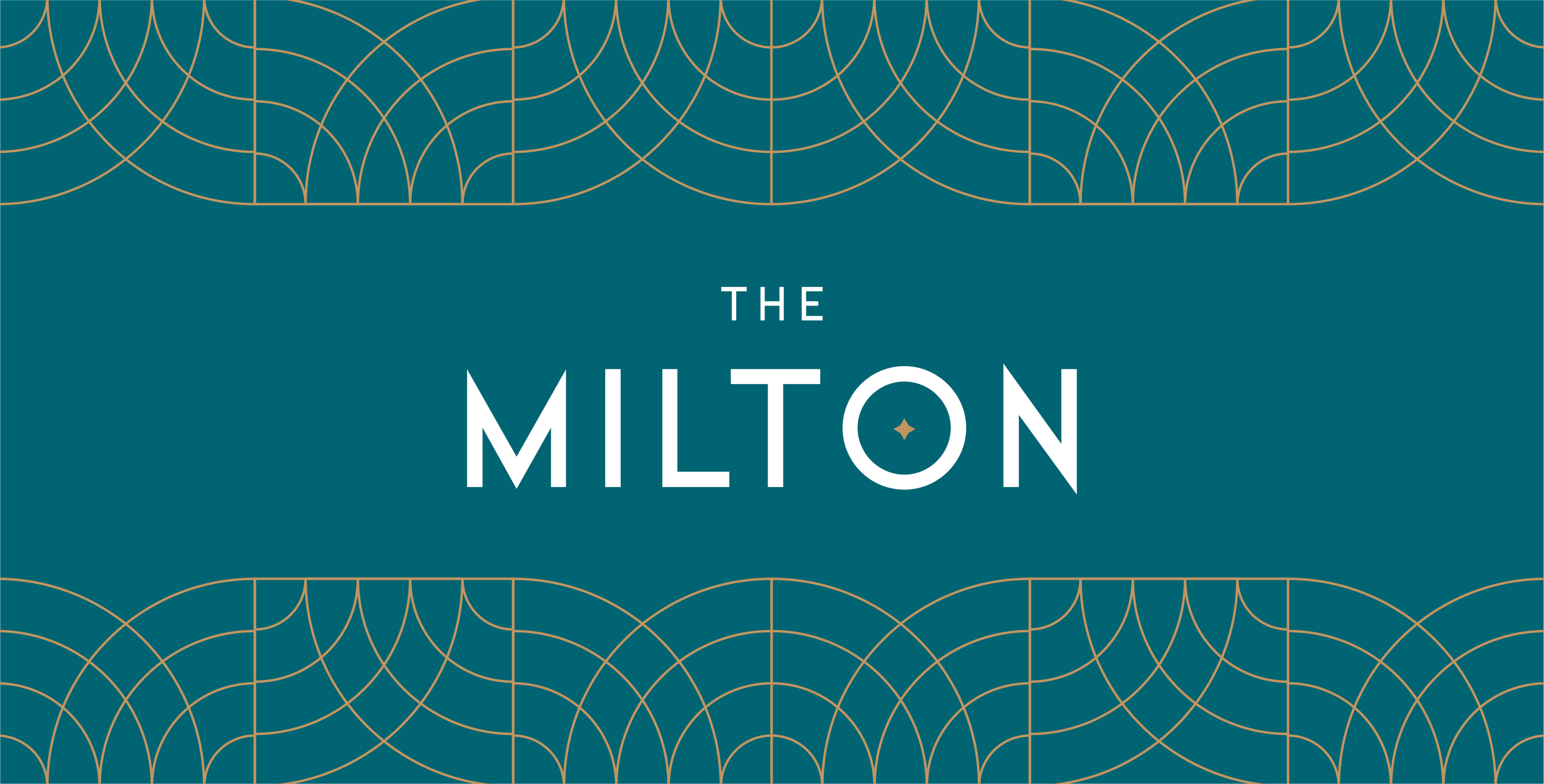
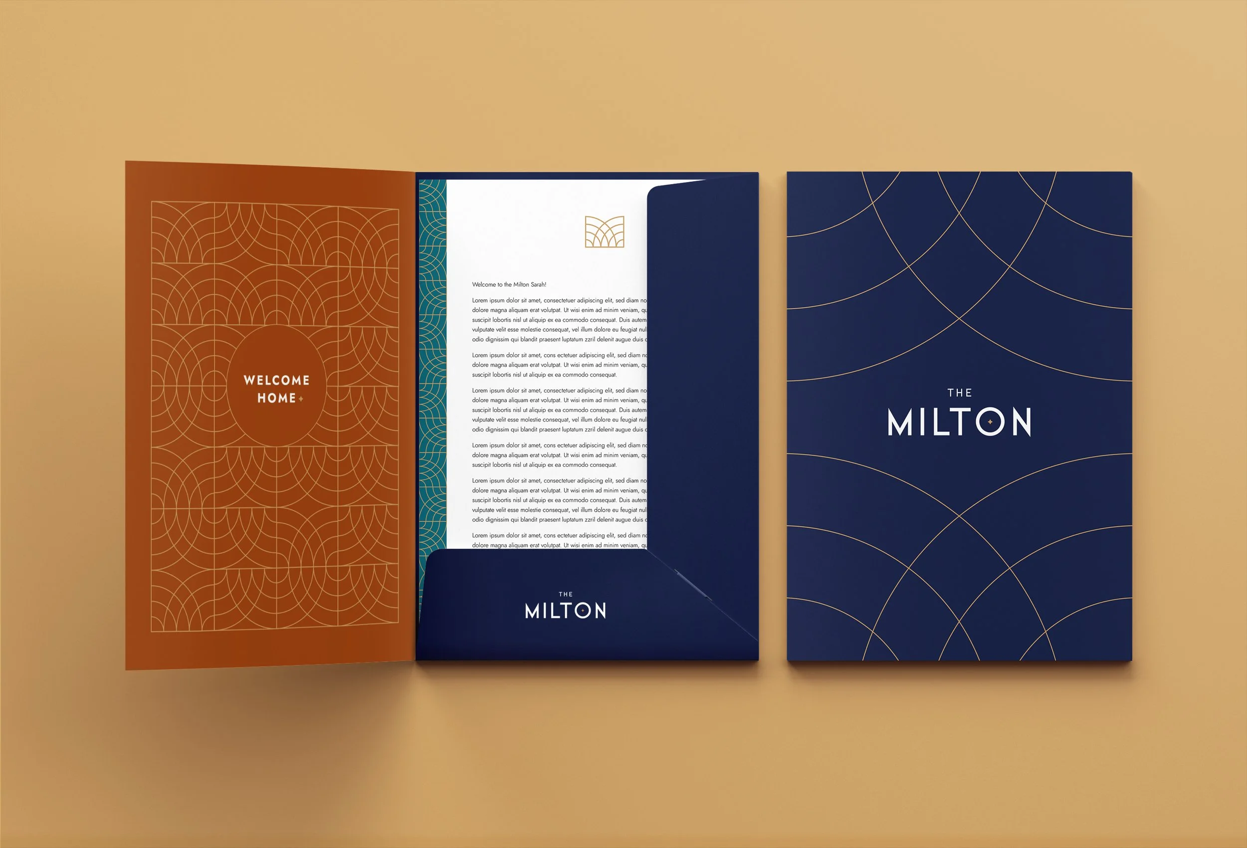
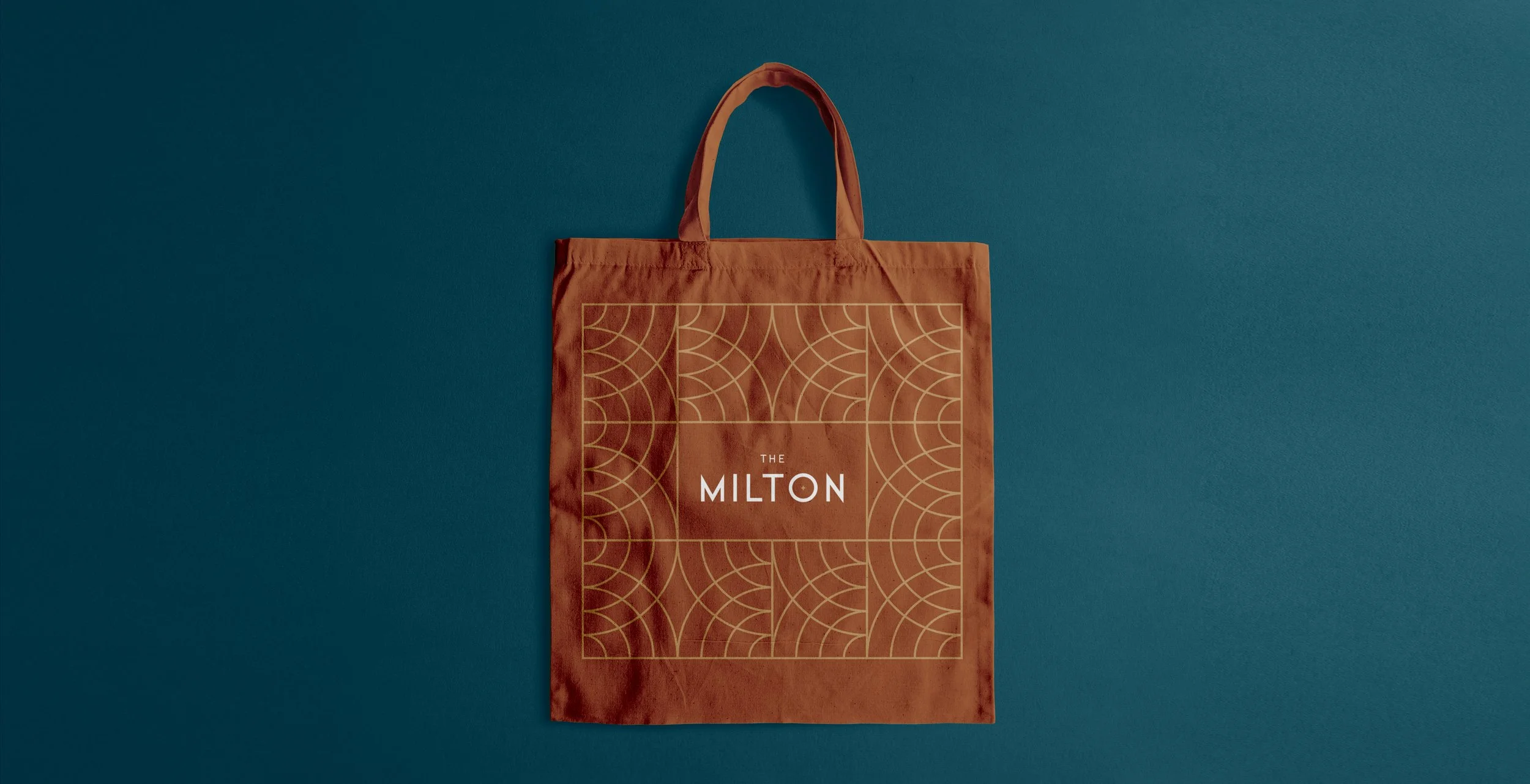
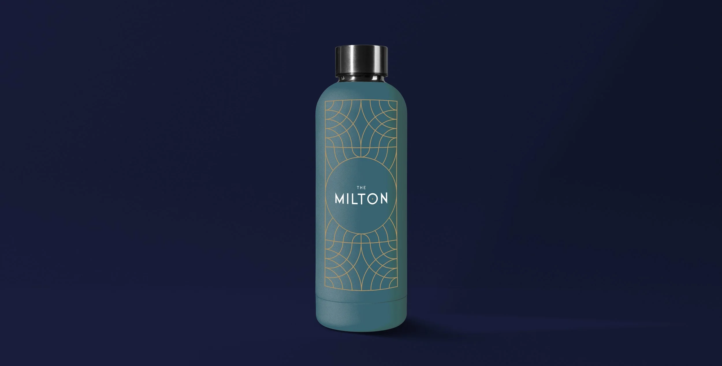
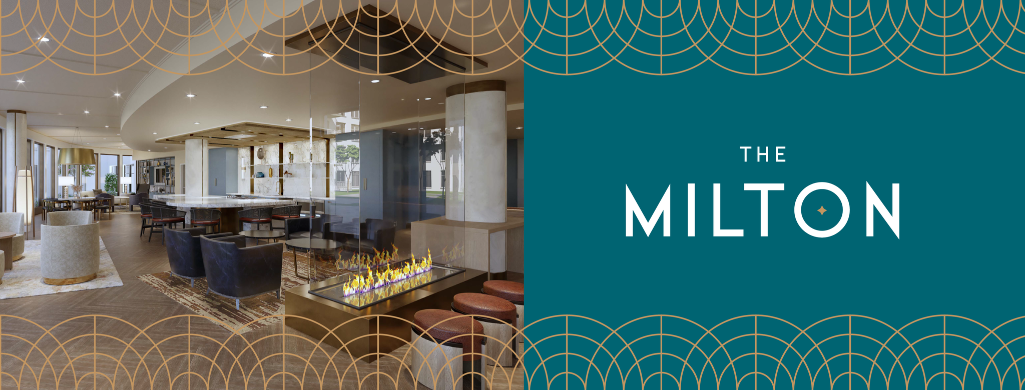
The resulting brand whispers of golden age glamour while asserting its place in the flourishing D.C. Metro area. At its core, The Milton's visual identity features a geometric wordmark, accented by a starburst that ripples through the brand like a champagne bubble in crystal. The emblem, an abstracted 'M', unfurls into a fluid pattern mirroring the building's elegant details.
This emblem expands into a larger visual narrative, weaving ornate patterns and luxurious details into the fabric of The Milton's brand. The color palette tells its own story of opulence and warmth. Midnight provides a sophisticated backdrop, while Ochre and Peacock add depth. Brass layering brings a touch of decadence, like fine jewelry adorning an evening gown.
The Jost typeface bridges eras with its 1920s-inspired sans serif design, adding modern crispness to the Art Deco aesthetic. It speaks of luxury in hushed tones, inviting residents to write their own stories. The Starburst detail punctuates headlines, a golden exclamation point in the narrative of luxury living.
Perhaps most captivating is The Milton's pattern, an intricate dance of lines and curves born from the emblem. At first glance complex, it reveals its simple beauty upon closer inspection. This pattern flows through the brand, framing content and photos, and setting a tone of refined elegance throughout The Milton experience.
In crafting this brand, BF Saul has woven a tapestry of elegance, history, and modern luxury. The Milton at Twinbrook Quarter offers more than just a place to live; it presents an opportunity to step into a world where past glamour meets present comfort. It's not just a residence; it's a statement, an experience, a homecoming to elegance – all wrapped in a brand that speaks volumes without saying a word.
Work completed at Fathom Creative. The project team included:
Kat Scott – Creative Direction, Bethany Whitlock – Art Direction/Design, Heather Gregg – Project Management