National Association of Clean Water Agencies
Visual identity, brand collateral
-
NACWA, the National Association of Clean Water Agencies, approached us with a clear mission: to refresh their brand identity in a way that would resonate with industry leaders and policymakers. As champions of clean water agencies nationwide, they needed a visual voice as powerful and clear as their cause. Our challenge was to create a brand that flowed seamlessly across all channels, elevating NACWA's professional image while highlighting the energy and collaboration at its core.
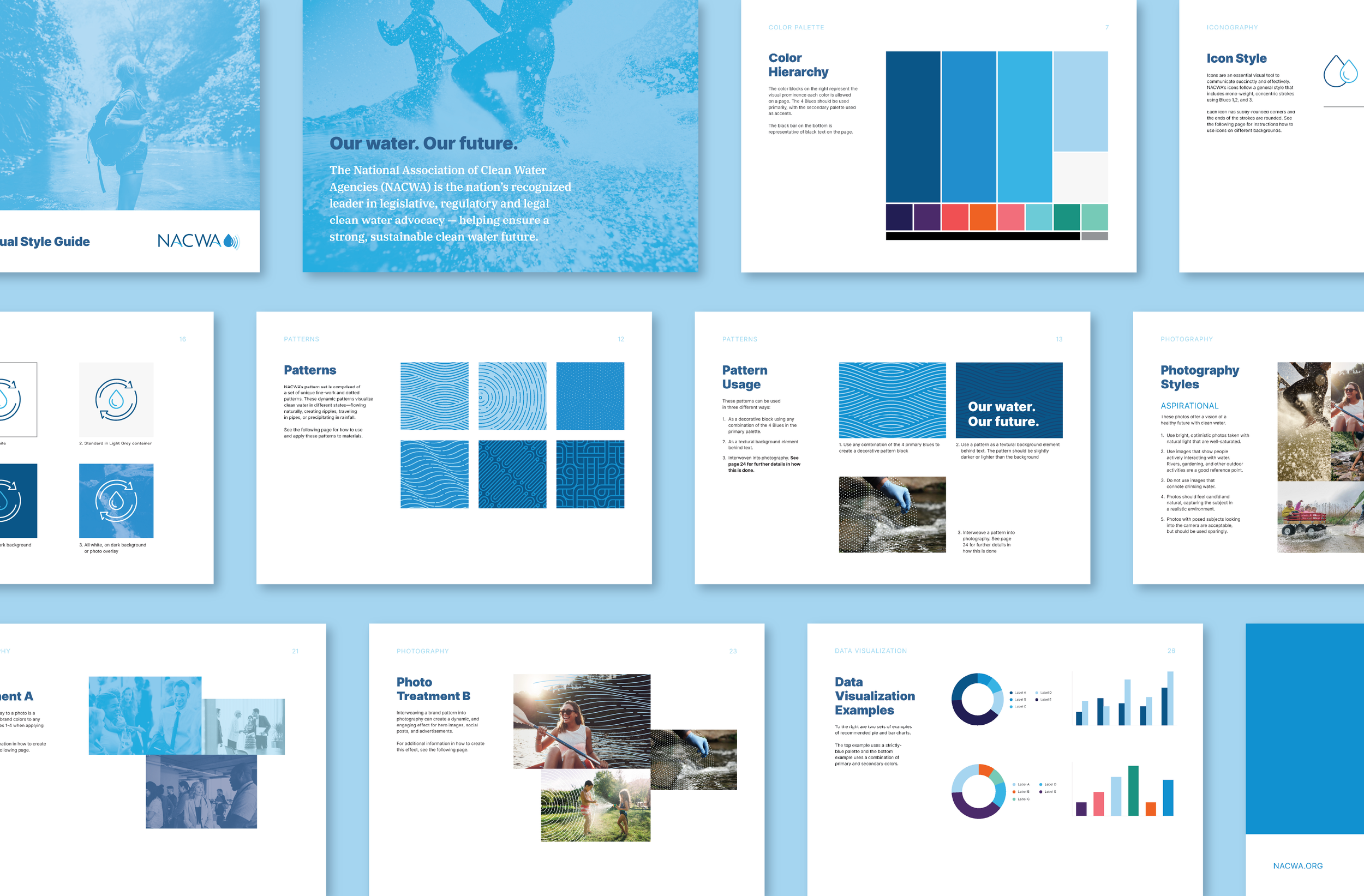
We dove deep into NACWA's world, understanding their role as trusted advocates and industry unifiers. From this insight, we crafted a brand identity that speaks volumes without saying a word. We started with typography, selecting refined Google Fonts that convey authority and approachability. Our color palette centers on blues, creating a hierarchy that reflects NACWA's connection to water, with strategic pops of color adding vibrancy and interest.
Iconography became a key player in our design strategy. We developed a mono-weight style with subtle rounded edges, nodding to NACWA's water droplet logo while ensuring consistency across applications. These icons, primarily in blues, serve as visual shorthand for complex ideas, making information more digestible for NACWA's sophisticated audience.
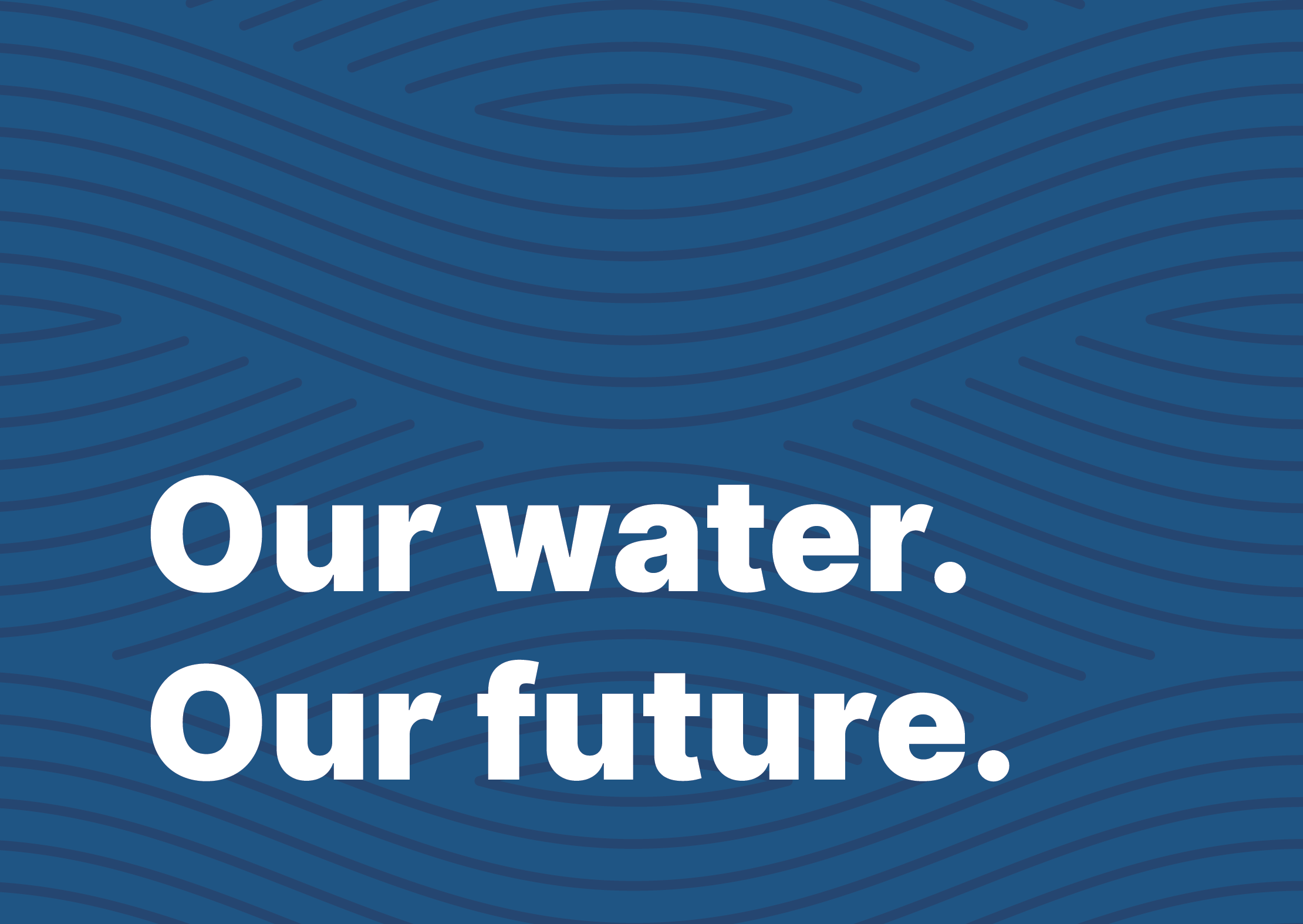
To add depth and visual interest, we created a set of unique patterns inspired by water's many states - flowing, rippling, traveling through pipes, and falling as rain. These versatile designs can stand alone, serve as textural backgrounds, or interweave with photography, adding a dynamic layer to NACWA's visual storytelling.
Speaking of photography, we established guidelines that emphasize bright, optimistic images bathed in natural light. We focused on three categories: member photos capturing candid moments of collaboration, aspirational images showcasing a clean water future, and process shots that tell the story of water transformation. By avoiding drinking water imagery and emphasizing professional interactions and environmental impact, we ensured the visuals align perfectly with NACWA's mission.
The result is a brand identity as fresh and impactful as the clean water NACWA champions. It's a visual system that flows effortlessly from reports to social media, from conference materials to policy briefs. This new look doesn't just represent NACWA - it embodies their strength, their expertise, and their crucial role in shaping the future of clean water. It's a brand that makes waves, just like the organization it represents.
Work completed at Fathom Creative. The project team included:
Kat Scott – Creative/Art Direction, Noah Mooney – Design, Allison Worsham – Project Management


