

Common Thread Consulting
Logo design, visual identity, brand collateral


-
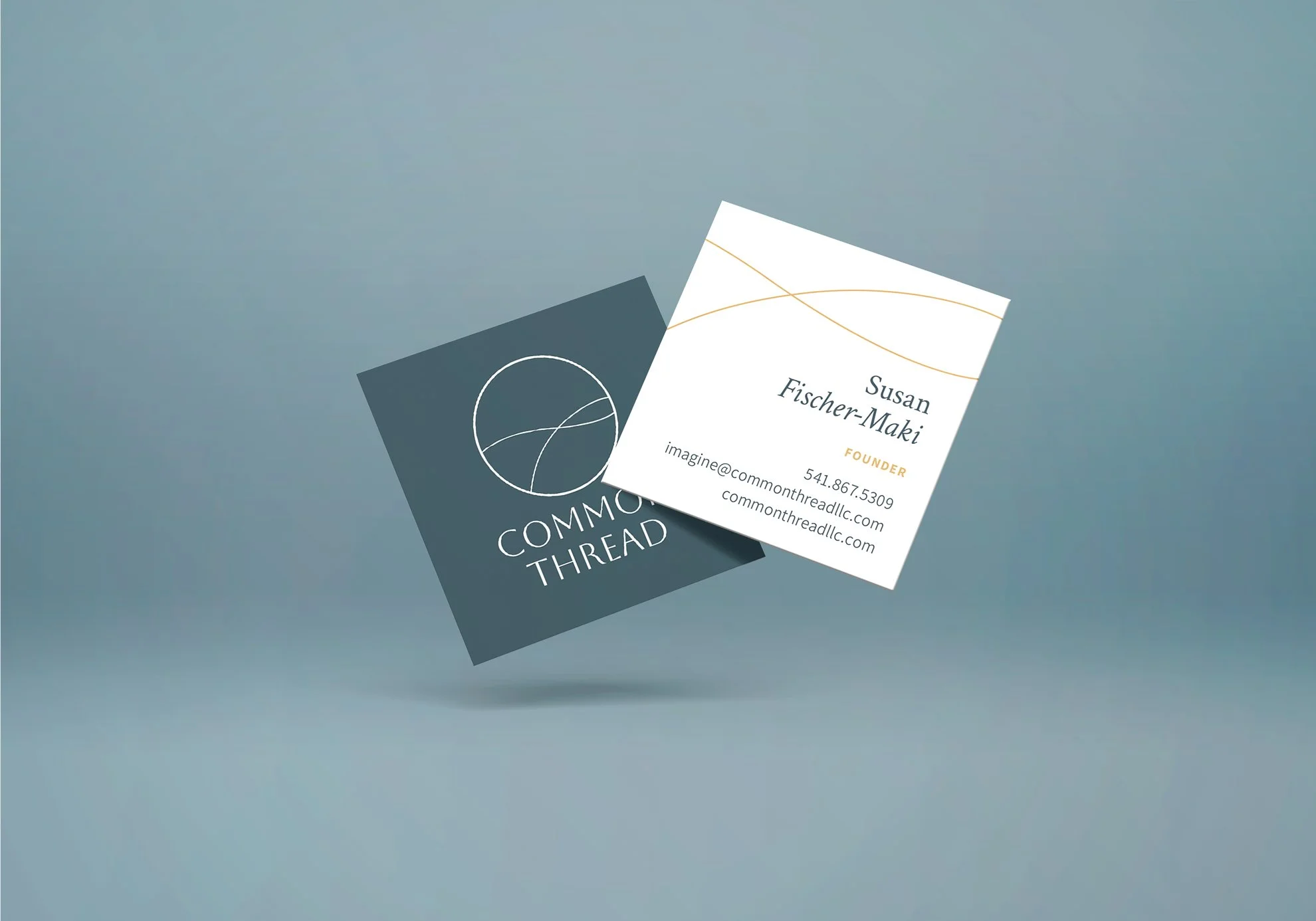
I met Susan on a typical rainy day in Portland. Her passion for her community shone through as she discussed various organizations: workforce investment boards, coordinated care organizations, groups focused on social determinants of health and health equity, and early learning hubs. Susan had secured grants, influenced policies, and worked tirelessly with her community in Grants Pass, Oregon, to help it thrive. She emphasized, "You make progress in a community when you find a common thread and network across the state with those who know and trust you." Her primary goal was connecting families to services and support.
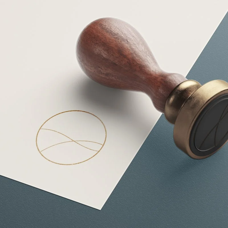
The logo reflects this mission—an elegant circle with thin, undulating lines inspired by a free strand of thread. It forms a T-shape cleverly cropped to resemble rolling hills, symbolizing common ground. The color palette is nourishing, rooted in wellness and nature: deep blues and greens, golden wheat tones, and cloudy blues combine to create a soothing experience.
With this new branding, Susan can confidently respond to RFPs and build brand recognition beyond Grants Pass, extending throughout the state as she expands her network.
Work completed by Kat Scott.
Kat Scott – Creative Direction, Design, Project Management