
CMO Syndicate
Logo design, visual identity, brand collateral


-
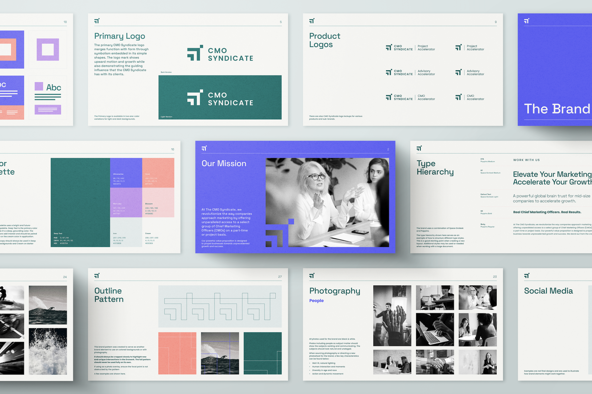
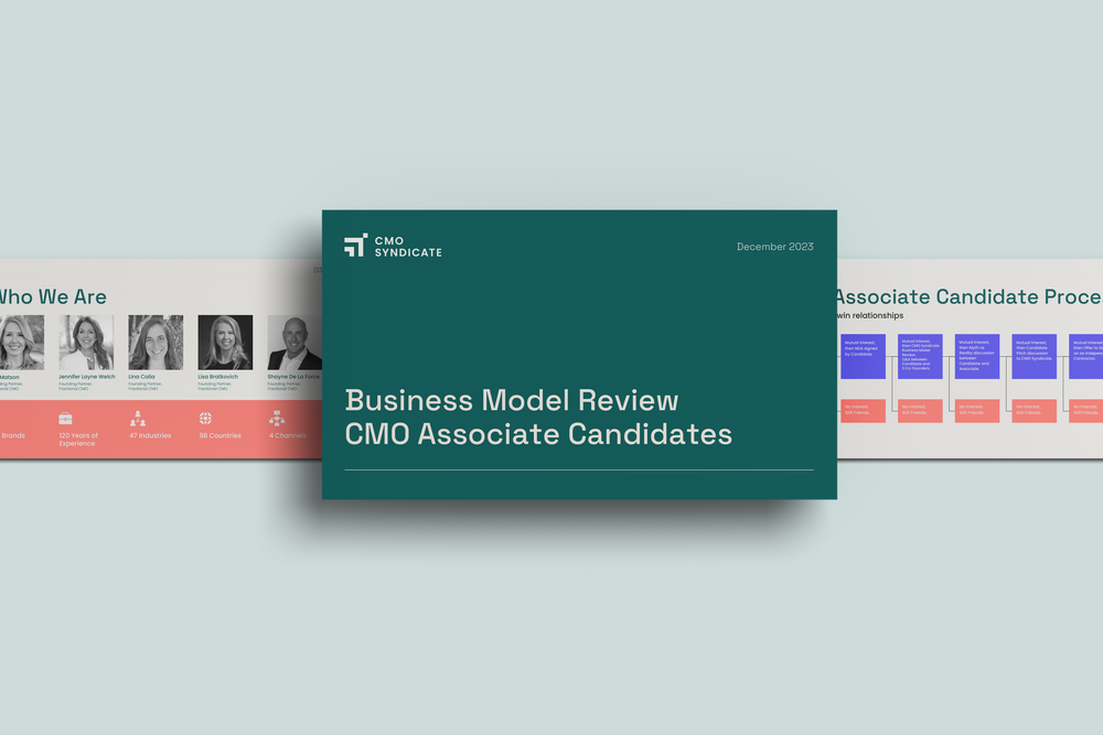
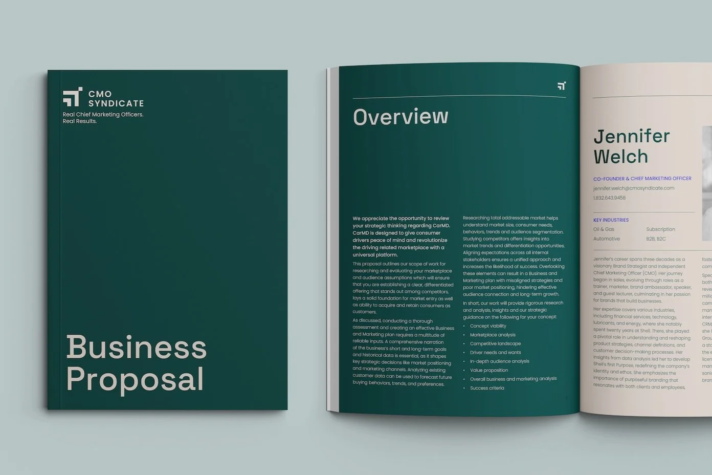
The CMO Syndicate, a coalition of experienced fractional CMOs, approached us with a common challenge: their bootstrapped logo and identity no longer suited their needs. They sought a forward-looking visual identity to win more clients by making a strong professional impression and to prove their concept to other CMOs as they expanded their network (or "braintrust"). Our solution centered on a clean logo design with embedded symbolism, featuring simple shapes showing upward motion and growth while representing CMO Syndicate's guiding influence on clients.
We developed a bright, future-forward color palette, using neon secondary colors grounded by a rich teal. For typography, we chose the tech-inspired Space Grotesk as the primary font, paired with Poppins, which mirrored Space Grotesk's geometric shapes. To complement the vibrant colors, we recommended black and white photography with a focus on motion-oriented images, incorporating action, blur, or time-lapse effects.
Our design strategy also included using an outline version of the logo mark to create visual interest and guide viewers' eyes across designs. This refined branding approach effectively captured CMO Syndicate's thought leadership and industry expertise. The result was a visual identity that resonates with high-level professionals, positioning CMO Syndicate as a premier partner for industry leaders.
Work completed at Fathom Creative. The project team included:
Kat Scott – Creative Direction, Cameron Maher – Art Direction, Riley Permann – Design, Heather Gregg – Project Management