Clarience Technologies
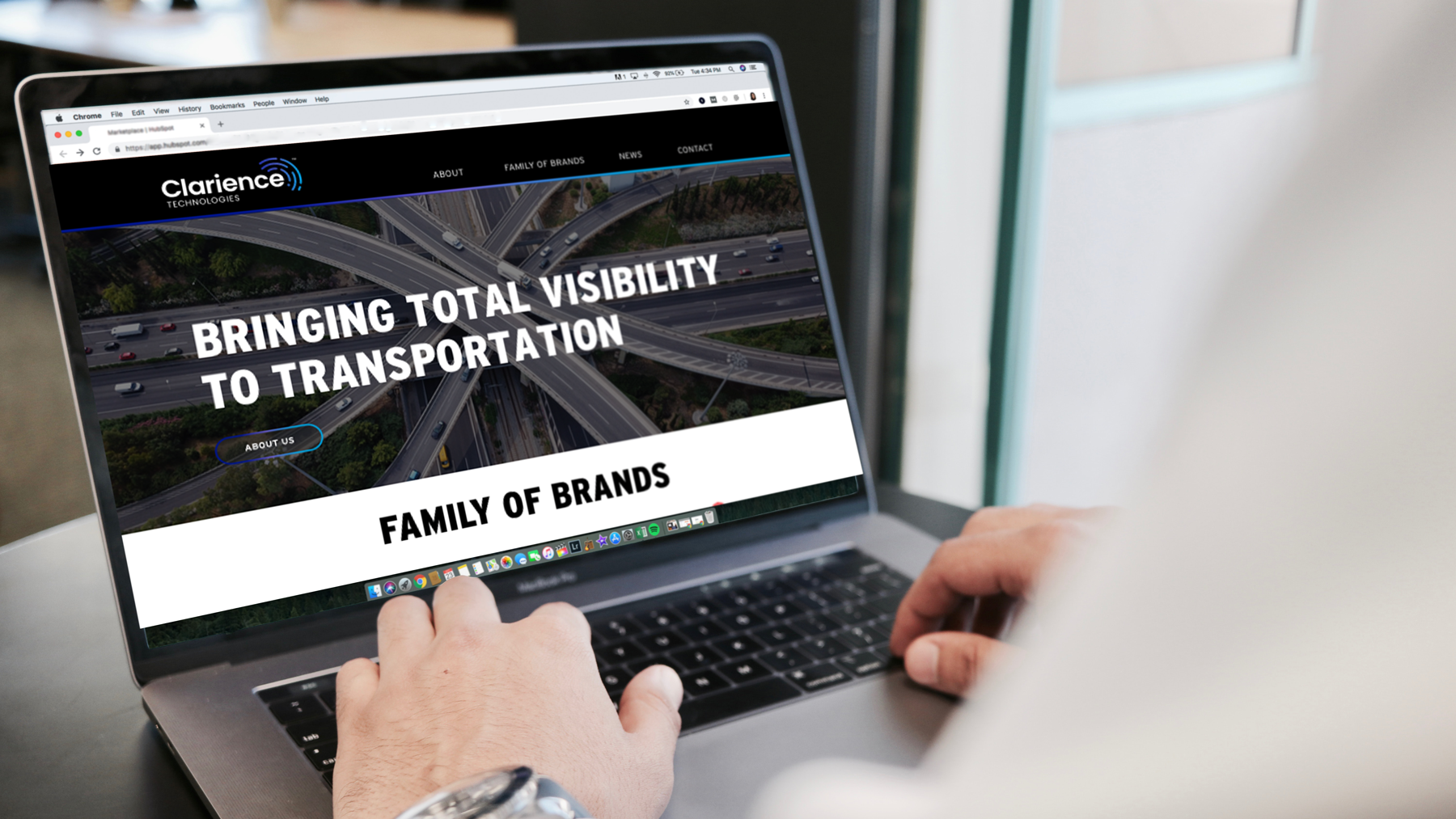
Logo design, visual identity, brand collateral, website design
-
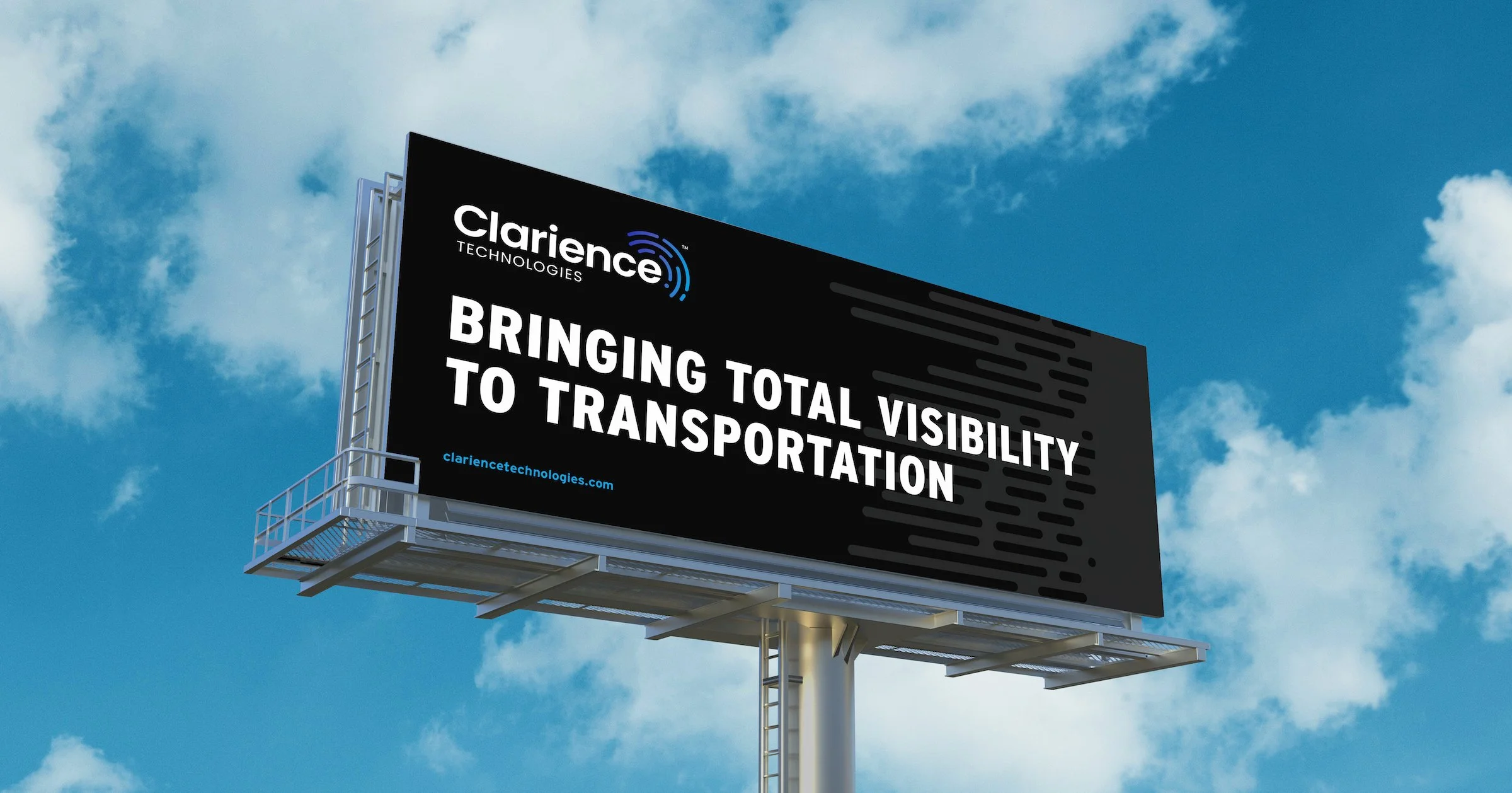
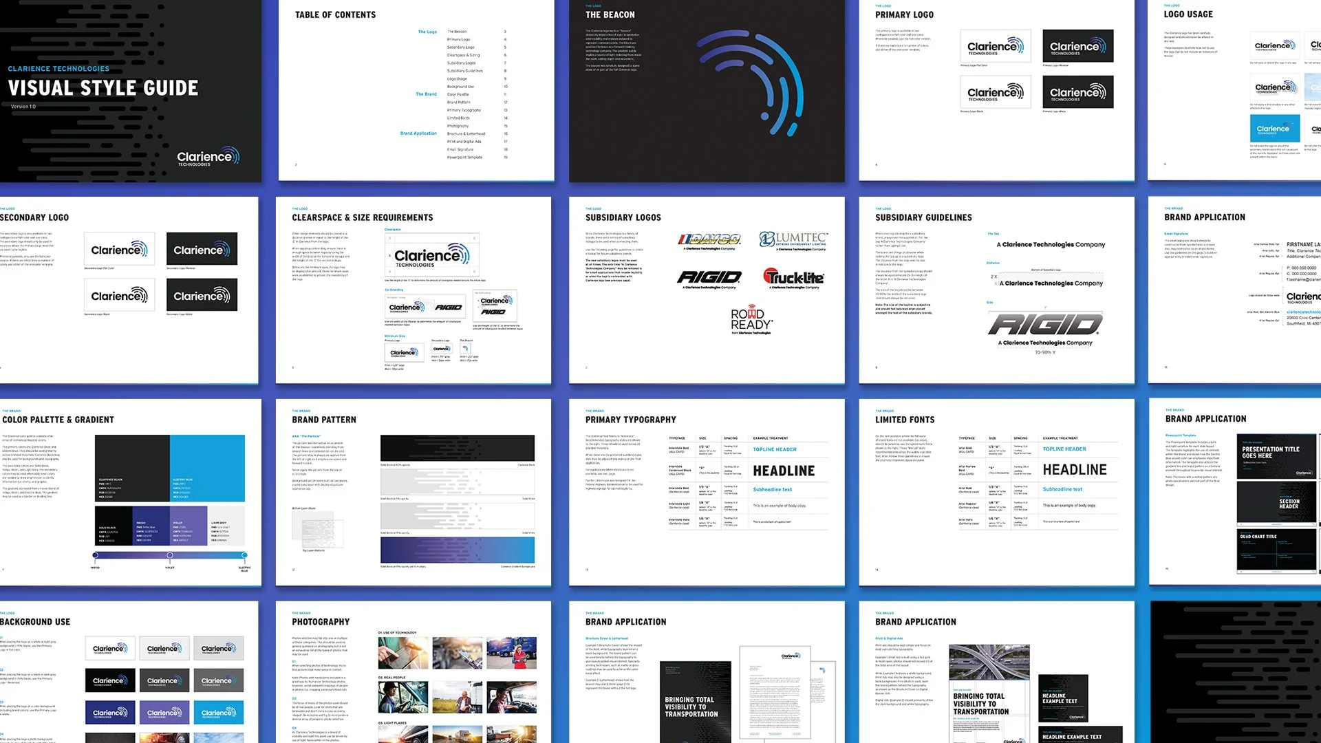
Clarience Technologies originally came to us as Truck-Lite Holdings LLC in need of a new name and identity that better reflected its new mission: providing total visibility to the commercial and recreational transportation industry. We created Clarience by combining "clarity", the insight the company brings to its customers, and "science", or how it is achieved.
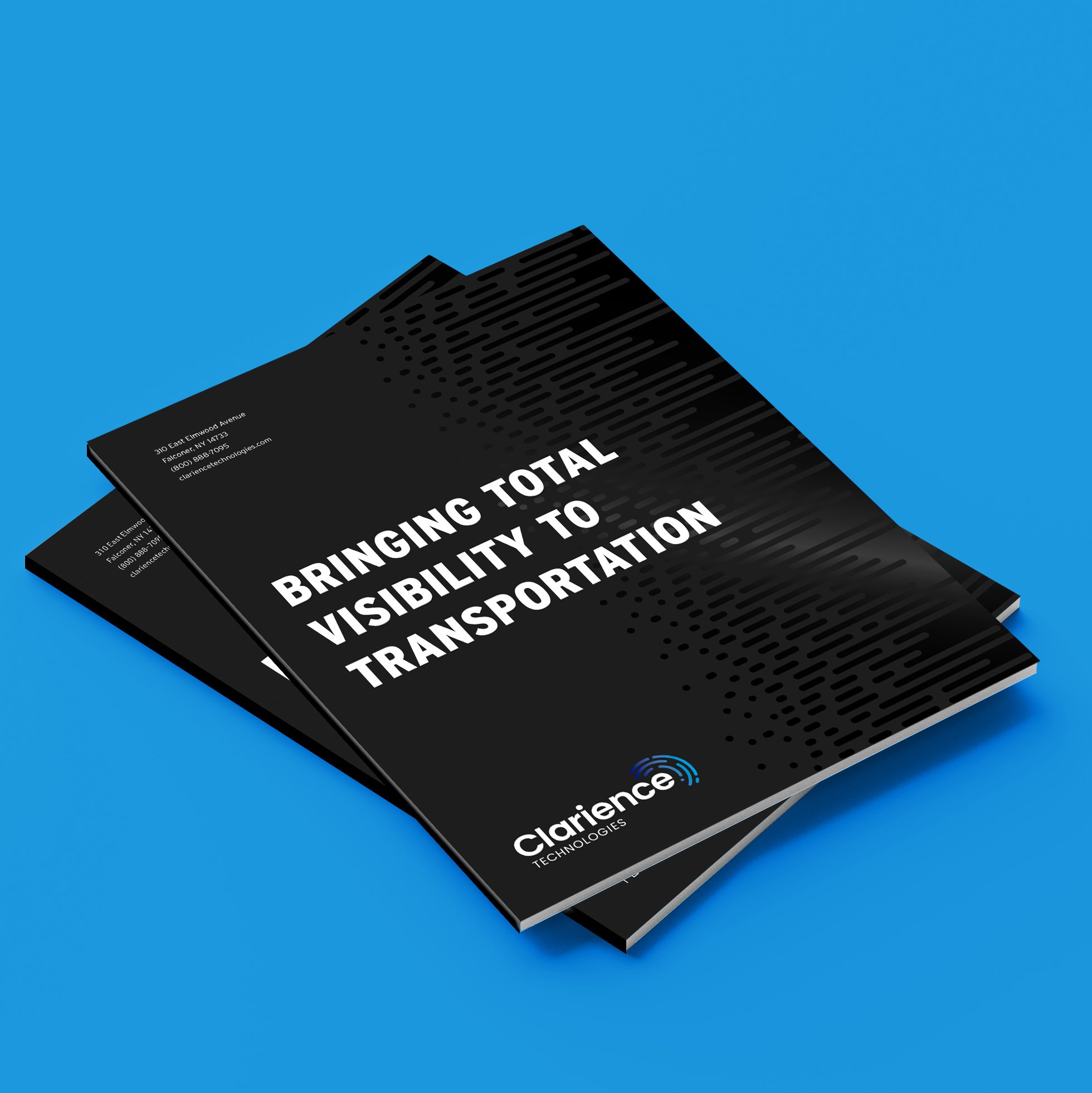
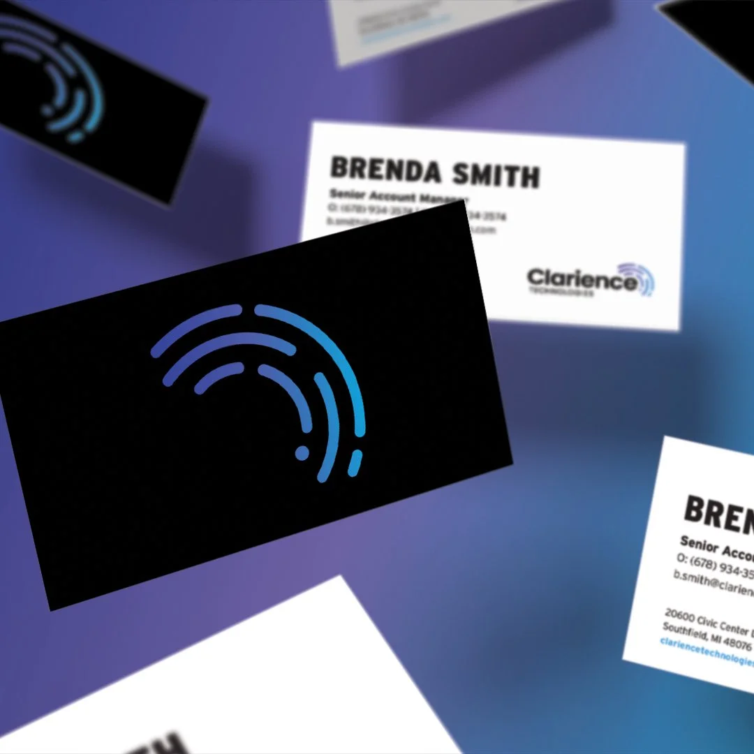
The logo mark–what we call the Beacon–symbolizes total visibility and radiates outward to represent communication. The blue gradient subtly implies a source of light inside the mark, which adds depth and movement to the logo. The brand pattern conveys movement and emphasizes the company’s future-oriented mindset.
For the color palette, we selected an array of technology-inspired colors. We used the font Interstate to pay homage to their roots in the trucking. Fun fact: The Federal Highway Administration used Interstate for highway signage due to the font’s optimal legibility.
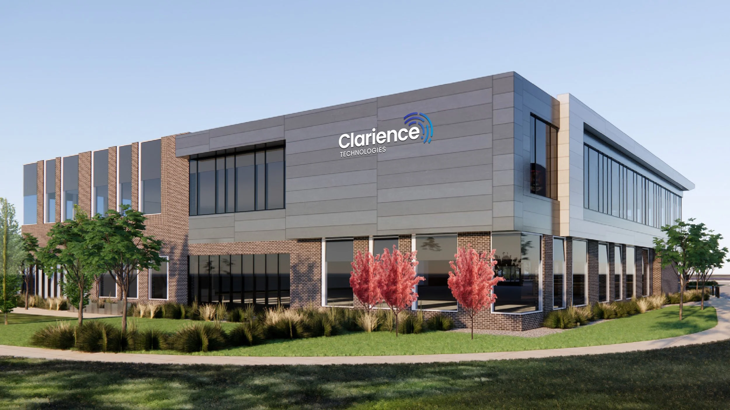
The new name and identity position Clarience Technologies as an innovative, future-facing leader in the transportation industry. CEO Brian Kupchella called it "a home run... It has really helped our growth strategy and painted a clear picture for our customer base of where we're going."
Work completed at Fathom Creative. The project team included:
Kat Scott – Creative Direction, Bethany Whitlock – Art Direction/Design, Heather Gregg – Project Management

